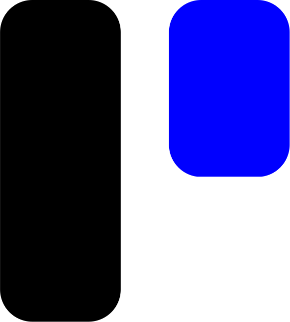
Light Version
Use primarily on white, light grey, or neutral backgrounds.
Format: SVG
Official Identity Guidelines
This document outlines the core visual rules and standards for utilizing the Design Stream assets. Consistently applying these guidelines preserves our brand integrity across all digital and print surfaces.
Use primarily on white, light grey, or neutral backgrounds.
Format: SVG
Reserved for deep backgrounds, dark mode UI, and black surfaces.
Format: SVG
The icon can stand alone when the brand name “Design Stream” is already visible in the immediate context, such as in-app navigation, social profiles, and app launcher icons.
Format: SVG
The wordmark may be used alone only when spatial constraints prevent the inclusion of the brand icon. Text should always be set in Archivo SemiBold.
Stream Blue
Primary Brand Accent
Stream Black
Structure & Primary Text
Stream White
Backgrounds & Light Accents
Brand-defining geometric grotesque typeface.
Design Stream
Aa Bb Cc Dd Ee Ff 1 2 3
ABCDEFGHIJKLMNOPQRSTUVWXYZ
abcdefghijklmnopqrstuvwxyz
1234567890 @#$%&*()_+
Note: Always set the wordmark tracking to -1% or -2% at large display sizes to optimize structural balance.
The clear space surrounding the lockup must always exceed the height of the brand icon. Let x be the total height of the icon. Keep a minimum margin of 1x on all four boundaries.
(Min. Icon: 20px tall)
(Min: 6mm / 0.25in tall)
To guarantee legibility, the primary brand logo lockup should never be scaled below 20px in height on any digital display or 6mm in physical high-resolution print.
Prohibited Alterations
© 2026 MonoMind. All rights reserved.
Version 1.0.1 • Released September 2026